Mobile App Accessibility Under the EAA: A POUR Checklist for iOS and Android Teams
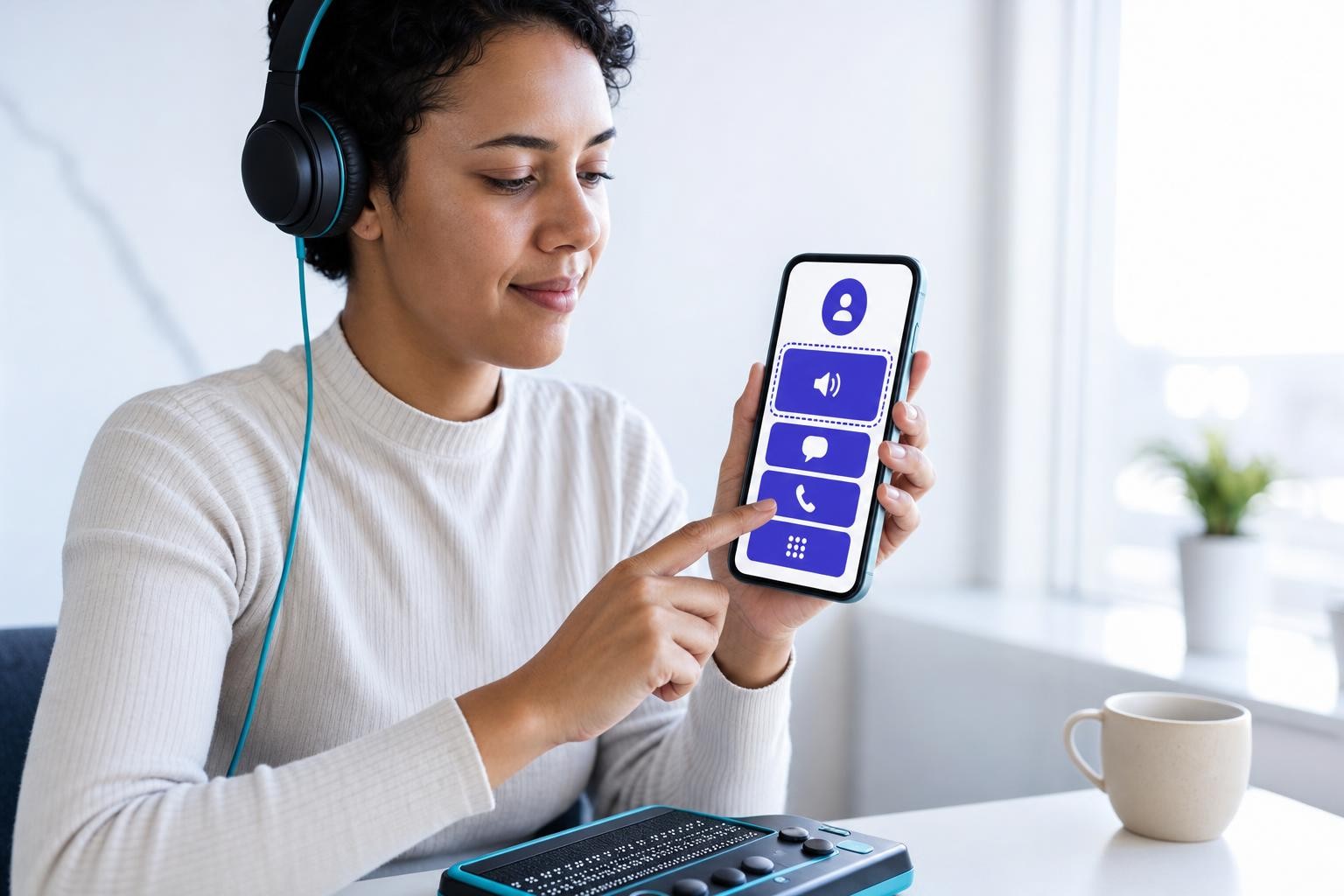
Most accessibility conversations start with websites. But if your team ships a native iOS or Android app in banking, e-commerce, transport, telecoms, or e-books to EU users, the European Accessibility Act applies to you directly - and it has since 28 June 2025.
The EAA (Directive 2019/882) named mobile applications explicitly, and its requirements became applicable on 28 June 2025. The technical benchmark is EN 301 549 v3.2.1, which maps WCAG 2.1 Level AA principles onto non-web software through Chapter 11 - a chapter dedicated entirely to mobile and desktop applications. Importantly, the European Commission itself notes that WCAG does not technically apply to mobile apps directly; EN 301 549 adapts those principles into the mobile context. That distinction matters when you are writing a conformance report.
The scale of the problem is not abstract. Around 72% of mobile user journeys tested had accessibility barriers rated Poor or Failing, and a large-scale analysis of approximately 10,000 apps found that 23% failed to provide accessibility metadata for more than 90% of their image-based buttons. Screen reader users now prefer mobile apps over websites for common online tasks - 58% of respondents in the WebAIM 2024 survey said they prefer apps - yet mobile apps remain one of the most consistently problematic areas for accessibility.
Enforcement is no longer theoretical. Germany's BFSG (Barrierefreiheitsstärkungsgesetz) allows fines of up to €100,000 per individual accessibility violation, and the Abmahnung system means competitors can file cease-and-desist claims against non-compliant businesses under unfair competition law without waiting for a regulator. The Netherlands' ACM can impose fines of up to €900,000 or 10% of annual revenue, whichever is higher, and has required mandatory self-reporting of compliance status since October 2025. French injunctions filed in late 2025 explicitly targeted both websites and mobile applications.
For a full picture of fines by country, see our EAA fines and penalties guide. For the broader EAA overview, see The European Accessibility Act is now in force. This post focuses on what product, design, and engineering teams need to do inside the app itself.
The POUR Framework Applied to Native Mobile
EN 301 549 organises its requirements around the same four principles as WCAG: Perceivable, Operable, Understandable, Robust. The checklist below maps each principle to concrete, platform-specific actions.
Perceivable
Users must be able to perceive all information in your app regardless of sensory ability.
Labels and text alternatives
Every non-decorative image, icon, and interactive control needs a meaningful accessible name.
- iOS: Set
accessibilityLabelonUIImageView,UIButton, and any custom control. In SwiftUI, use.accessibilityLabel(). The label should describe what the element does, not its visual appearance - "Add to favourites" rather than "heart icon". Do not include the control type (e.g. "button") in the label; VoiceOver reads that fromaccessibilityTraitsautomatically. - Android: Use
android:contentDescriptiononImageView,ImageButton, andCheckBox. ForEditTextfields, useandroid:hintinstead ofcontentDescription- TalkBack reads the hint as the accessible name before text is entered, and it reappears when the field is cleared. - Mark purely decorative images as non-accessible so screen readers skip them and reduce noise.
A large-scale study found that 93% of Android "floating action buttons" - a common UI pattern - lacked a content description, making them inaccessible to TalkBack users. This is not a niche edge case; it is the default state of one of Android's most-used interactive elements.
Colour contrast
- Normal text (below 18pt / 14pt bold): minimum 4.5:1 contrast ratio against its background (WCAG 1.4.3).
- Large text and UI component boundaries: minimum 3:1 (WCAG 1.4.11).
- Never convey information by colour alone - combine colour with text, icons, or patterns. An error state shown only in red is invisible to users with colour-vision deficiency.
Text resize and reflow
- iOS: Support Dynamic Type. Use
UIFontMetricsor SwiftUI's.font(.body)(and other semantic sizes) so text scales with the user's preferred size. Test at the largest accessibility size - "XXXL" - and ensure no text clips or overflows its container. - Android: Set text sizes in
spunits, neverdporpx. This allows the system to scale text with the user's font size preference. - Xcode's Accessibility Inspector lets you simulate Dynamic Type sizes without changing device settings - use it on every screen.
Captions and audio descriptions
Any video content must have captions. Pre-recorded audio-only content needs a transcript. These are not optional extras; they are WCAG 1.2 requirements that EN 301 549 carries into mobile.
Operable
Users must be able to operate all functionality regardless of how they interact with the device.
Touch target size
Apple's Human Interface Guidelines recommend a minimum touch target of 44×44 points; Android's Material Design guidelines recommend 48×48 dp with 8 dp spacing between targets. Both figures exist because smaller targets create significant tap-error rates for users with motor impairments - and for anyone using the app one-handed on a moving bus.
WCAG 2.5.5 (Target Size, AAA) and the newer 2.5.8 (Target Size Minimum, AA in WCAG 2.2) reinforce this. For EAA compliance under EN 301 549, the platform-native minimums are your practical floor.
Full VoiceOver and TalkBack operability
Every task a sighted user can complete must be completable using only the screen reader. This means:
- All interactive elements are focusable and reachable by swiping through the accessibility tree.
- Custom gestures (swipe-to-delete, pinch-to-zoom, drag-and-drop) have an accessible alternative - a button, a menu item, or a long-press action.
- Modals and bottom sheets trap focus correctly: VoiceOver/TalkBack should not be able to reach elements behind a modal while it is open. On iOS, use
accessibilityViewIsModal = true; on Android, useimportantForAccessibility="no-hide-descendants"on the background content. - Custom gestures must not conflict with VoiceOver's built-in gesture set (e.g. a two-finger swipe is a system gesture).
Logical focus order
VoiceOver and TalkBack move through elements in the order they appear in the accessibility tree, which does not always match visual layout - especially in constraint-based or absolute-positioned UIs.
- iOS: Use
accessibilityElementson container views to define the explicit reading order. In SwiftUI, use.accessibilitySortPriority(). - Android: Use
android:focusableandandroid:nextFocusDown/android:nextFocusRightattributes to control keyboard and switch navigation order.
Test by navigating your entire app with VoiceOver or TalkBack without looking at the screen. If you feel lost, your users will too.
External keyboards and Switch Control
Mobile screen reader use reached 91.3% in the WebAIM 2024 survey, with VoiceOver leading mobile at 70.6% - meaning the vast majority of screen reader users are on mobile devices. Many of those users also rely on external Bluetooth keyboards or Switch Control (iOS) / Switch Access (Android).
- Ensure all interactive elements are reachable and activatable via keyboard Tab/arrow navigation.
- There must be no keyboard traps - users must be able to navigate into and out of every component.
- On iOS, test with a Bluetooth keyboard connected. On Android, use
android:focusable="true"and verify the focus highlight is visible.
Understandable
Users must be able to understand the information and operation of the interface.
Consistent navigation and predictable behaviour
- Navigation patterns (tab bars, side drawers, back buttons) must behave consistently across the app. Changing the position of navigation elements between screens without warning disorients screen reader users.
- Avoid triggering context changes automatically on focus. If selecting an item in a list immediately navigates away, announce that behaviour or provide a confirmation step.
Clear error messages
- Error messages must be specific and actionable: "Password must be at least 8 characters" rather than "Invalid input".
- Errors must be programmatically associated with the field they relate to. On iOS, use
accessibilityLabelorUIAccessibility.post(notification: .announcement, argument:)to announce errors. On Android, useAccessibilityEvent.TYPE_ANNOUNCEMENTor setandroid:accessibilityLiveRegion. - Never rely on colour alone to indicate an error state (see Perceivable above).
Form labels and instructions
- Every form field must have a visible, persistent label - not just placeholder text that disappears on focus.
- iOS: Associate labels with inputs using
accessibilityLabelor by grouping them with.accessibilityElement(children: .combine). - Android: Use
android:labelForto associate aTextViewlabel with itsEditText. This exposes the relationship to TalkBack and to theAccessibilityNodeInfoAPI. - If a field has a required format (date, phone number), state that in the label or in adjacent hint text - not only in an error message shown after submission.
Robust
Content must be robust enough to be interpreted reliably by current and future assistive technologies.
Use native platform accessibility APIs
This is the single most important principle for native mobile. When you use standard UIKit/SwiftUI components on iOS or standard Material/View components on Android, name, role, value, and state are exposed to the platform's accessibility tree automatically. When you build custom components, you must replicate that exposure manually.
- iOS - UIAccessibility protocol: Set
accessibilityLabel(name),accessibilityTraits(role, e.g..button,.header,.link),accessibilityValue(current value for sliders, toggles), andaccessibilityHint(what happens when activated). PostUIAccessibilityLayoutChangedNotificationwhen the screen updates dynamically so VoiceOver announces the change. - Android - AccessibilityNodeInfo: Custom views must override
onInitializeAccessibilityNodeInfo()to set the node's class name (role), content description (name), and state. UseViewCompat.setAccessibilityDelegate()for a less invasive approach. For live regions (chat messages, status updates), setandroid:accessibilityLiveRegion="polite"or"assertive".
WCAG 4.1.2 (Name, Role, Value) requires that for all user interface components, the name and role can be programmatically determined, and states, properties, and values can be set by the user and notified to assistive technologies. EN 301 549 Chapter 11 carries this requirement directly into native mobile software.
Test with real assistive technology on real devices
Simulators and automated scanners catch a subset of issues. They cannot tell you whether a label is meaningful, whether a flow is navigable end-to-end, or whether a modal correctly traps focus. Real-device testing is not optional.
Automated tools catch around 30–40% of accessibility issues — mostly code-level problems like missing labels or poor contrast. The remaining 60–70% require manual testing with assistive technology. Do not treat a passing automated scan as evidence of compliance.
Testing Your App
Use a layered approach: automated scanning in your build pipeline, manual screen reader testing before each release, and periodic testing with disabled users for major features.
Automated scanning
| Tool | Platform | What it catches |
|---|---|---|
| Accessibility Inspector (Xcode) | iOS | Missing labels, small touch targets, contrast issues, Dynamic Type clipping, VoiceOver simulation |
| Accessibility Scanner (Google) | Android | Missing content descriptions, small touch targets, low-contrast text |
XCTest performAccessibilityAudit() |
iOS (Xcode 15+) | Automated audit in your CI/CD pipeline |
| AccessibilityChecks (Espresso) | Android | Automated checks in your CI/CD pipeline |
Xcode 15 and iOS 17 introduced performAccessibilityAudit() in XCTest, enabling automated accessibility audits to run as part of your standard UI test suite.
Manual screen reader testing
iOS - VoiceOver:
- Enable VoiceOver: Settings -> Accessibility -> VoiceOver (or triple-click the side button if you have the shortcut set).
- Navigate your entire app using only swipe gestures. Do not look at the screen.
- Verify every interactive element announces a meaningful label, role, and state.
- Test modals, alerts, and tab bars - these are the most common focus-trap failure points.
- Use Xcode's Accessibility Inspector in parallel to inspect the accessibility tree without audio.
Android - TalkBack:
- Enable TalkBack: Settings -> Accessibility -> TalkBack.
- Navigate using swipe gestures and the two-finger scroll.
- Verify
contentDescriptionvalues are meaningful and not just the resource ID (e.g. "logo_1234_png"). - Test with a physical Bluetooth keyboard to verify keyboard navigation order.
- Use Google's Accessibility Scanner on each screen for a quick automated pass.
What to Do Now
If your app is in scope for the EAA - banking, e-commerce, transport, telecoms, e-books, or audiovisual services - and you have not yet assessed it against EN 301 549, here is a practical starting sequence:
Check whether your app falls under a covered service category and whether your company exceeds the microenterprise threshold (fewer than 10 employees and under €2 million turnover). Both conditions must be met for the exemption to apply.
Use Accessibility Inspector (iOS) and Accessibility Scanner (Android) on every screen of your app. Add performAccessibilityAudit() (iOS) or AccessibilityChecks (Android) to your CI pipeline so regressions are caught on every build.
Navigate your core user journeys — sign-in, checkout, account management — using only the screen reader. No looking at the screen. Log every point where navigation breaks, labels are missing, or focus is lost.
Prioritise: missing labels on interactive elements, touch targets below platform minimums, colour contrast failures, and any screen where VoiceOver/TalkBack cannot complete a transaction. These are the issues most likely to trigger complaints and enforcement.
Produce an accessibility statement for your app that describes your conformance status, known gaps, and a feedback mechanism. Under the EAA, service providers must make accessibility information available to users. Keep it updated with each release.
Accessibility is not a one-off audit. Add accessibility acceptance criteria to your definition of done, include screen reader testing in your QA checklist, and assign ownership so new features do not regress.
One final note on tooling: there is no overlay or automated widget that can make a native mobile app accessible. Accessibility in a native app is an engineering and design discipline - it requires correct use of platform APIs, real-device testing, and ongoing process. The good news is that both Apple and Google have invested heavily in their accessibility frameworks. When you use standard components correctly and test with real assistive technology, most of the work is already done for you.
Related reading

Motion Accessibility: The prefers-reduced-motion Guide for Front-End Teams
Parallax, scroll-jacking, and autoplaying video can cause real physical harm. Here's the complete technical guide to prefers-reduced-motion, WCAG 2.2.2, and vestibular accessibility.

Accessible Data Visualisation: A Practitioner's Guide to Charts That Actually Work
Beyond alt text: a deep technical guide to making charts, graphs and dashboards genuinely accessible - covering SVG semantics, colour, keyboard interaction, WCAG 2.2 and the EAA.

EAA CE Marking and the Product Compliance Machine Most Digital Teams Have Never Seen
CE marking, EU declarations of conformity, Annex IV technical files: the EAA's product-side compliance regime is nothing like an accessibility statement. Here is what every economic operator needs to know.